Designing Multi-Account Experiences
Many details have been omitted in compliance with organizational data and security policies.
Project Details
Client
Rhode Island Energy
Role
UX Writer & Content Designer
Timeline
16 weeks
Overview
Most of our utility products were originally built around a single-account model. Customers could only view and manage one service account at a time, which created friction for anyone with multiple homes, properties, or business accounts.
As the UX writer on the design team, I helped transform these single-account journeys into scalable multi-account experiences. My role focused on ensuring copy across dashboards, modals, tooltips, and success states was clear, consistent, and inclusive—while also aligning with our design system and voice guidelines.
The business need was simple: reduce customer service call volume and give users a seamless way to manage all their accounts in one place.
The challenge
- Legacy systems were designed for single accounts only
- Customers often called support because they couldn’t find or switch accounts easily
- Regulatory and compliance requirements limited some wording choices
- We had to balance customer-facing clarity with technical constraints (e.g., Paymentus, bulk pay, grouping logic)
- Consistency across multiple transactions (Auto Pay, Start/Stop/Transfer, usage reports, OnTrack)
Solving the Challenge
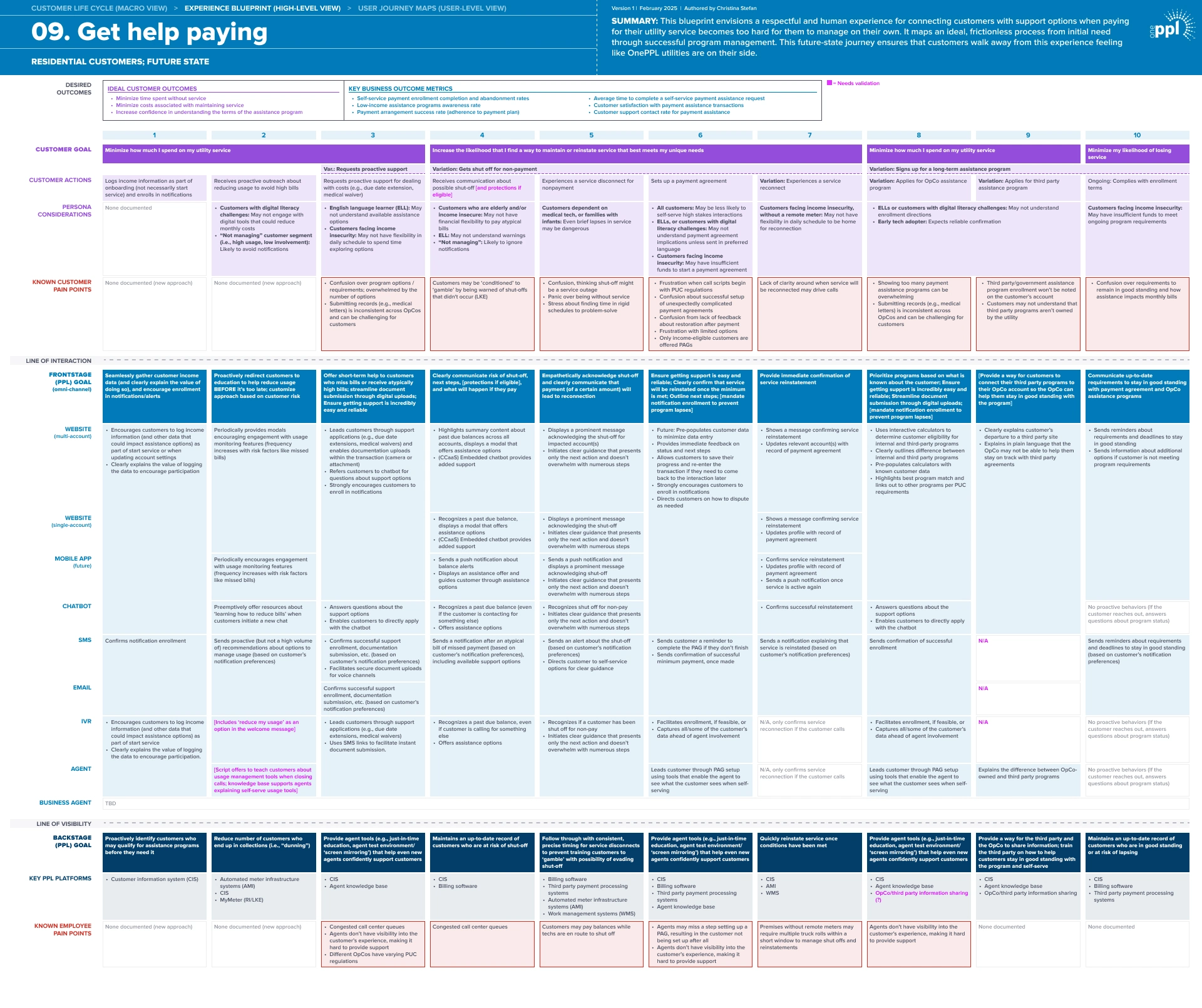
Understanding the existing experience
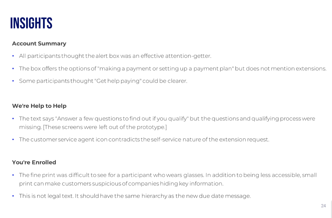
Before proposing any solutions, we took time to understand the current experience. We mapped out the legacy flow and identified multiple points where users might drop off or feel confused, especially when eligibility rules or instructions weren’t clear.
We knew our redesign had to make it easier for users to self-serve and reduce the need for customer support.
Creating consistency in language
Early versions mixed terms like “accounts,” “balances,” and “services,” which confused customers. I worked with designers and researchers to test and standardize terminology. We landed on “accounts” as the most intuitive word, then aligned button labels, tooltips, and empty states around it. This was al in service to creating a consistent, user-friendly vocabulary across all multi-account flows.
Streamlining viewing and grouping accounts
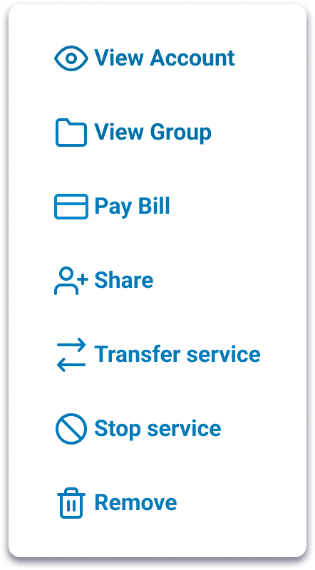
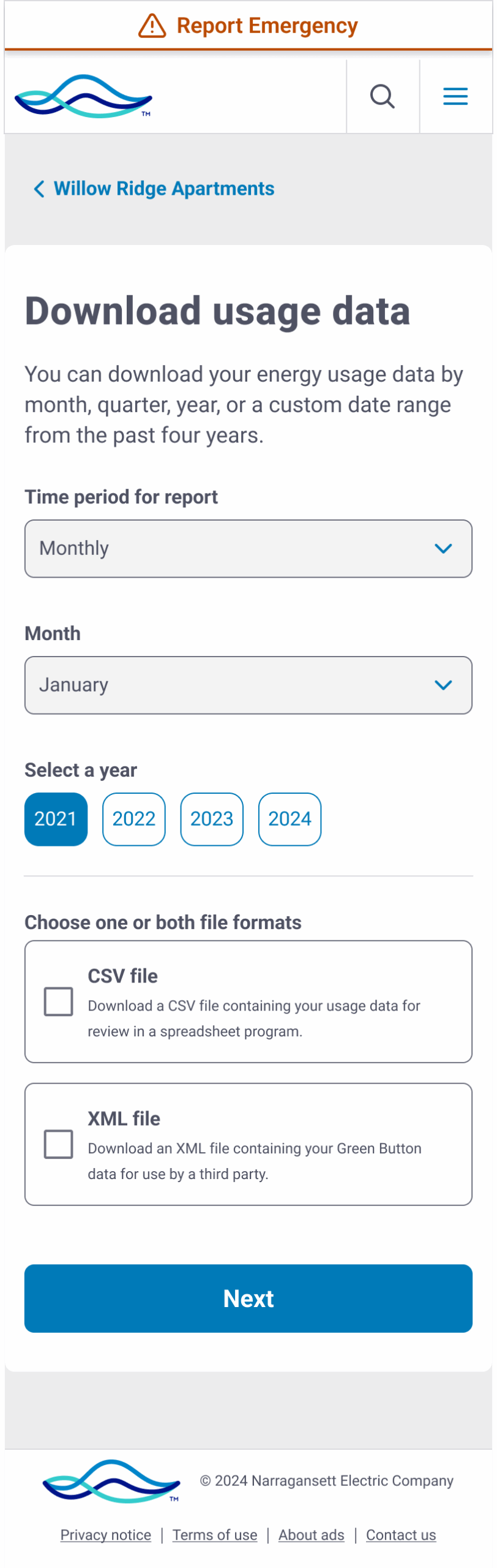
Customers didn’t know how to move between accounts or organize them, so I drafted copy for modals and dropdowns to make switching clear, wrote onboarding copy for new grouping features that let users cluster accounts (like “My Rentals” or “Business Properties”), and partnered with the design lead to test labels such as “Switch account” versus “View account.” The result was simple, direct instructions and dynamic body copy that scale across multiple accounts without redundancy.
Making bulk actions simple
Commercial customers needed to pay or download bills for dozens of accounts at once, but the UI language was too technical. I rewrote the selection guidance so users could easily choose all or some accounts, adjusted button and card labels to avoid confusion between “open” and “download,” and suggested dynamic error and success states that confirmed exactly which accounts were included. These changes led to bulk pay and bulk download flows that reduced errors and lowered call volume.
Research and testing
We tested these interactions with customers to make sure the language and flows were clear. In usability sessions, we observed how people switched between accounts and how easily they could complete tasks such as paying multiple bills or downloading usage reports. Testing with both residential and commercial customers confirmed that the revised copy and streamlined flows worked across different needs and levels of digital comfort.
Collaboration and process
This work couldn’t have happened in a silo. I collaborated daily with:
- Designers to make sure copy and layouts supported clarity across screens
- Researchers to test comprehension of account terms and flows
- Product owners to balance regulatory requirements with usability
- Fellow writers to document standards in our design system for future scalability
A key lesson we learned as a team: multi-account design is as much about content strategy as UI. The words define the mental model customers rely on.
Outcome
- Multi-account features are now live across dashboards, AutoPay, Start/Stop/Transfer, and billing flows
- Customer service reported fewer calls related to “I can’t find my account” issues
- Feedback showed customers appreciated being able to group and pay accounts without logging in and out repeatedly
- Our design system now includes patterns and copy standards for any future multi-account features
Next steps: continue refining account grouping labels, test dynamic headline approaches, and keep reducing redundancy in confirmation screens.